
What is Component Library?
A collection of pre-built UI elements like buttons, cards, and modals that you can install and use across your project. It gives your team a consistent starting point.
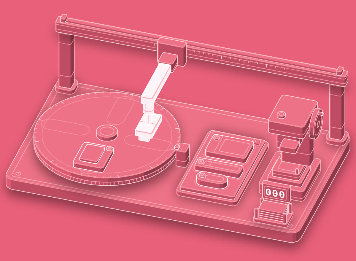
3 ready parts · 0 built new
A component library gives your project...
Write it in your own words in the app.
In real work
Build this settings page using our component library. Use existing Button, Card, and Input components. Do not create new ones.
In the illustration
The turntable indexes and the pick arm lifts a ready Button, Card and Input onto the settings-page tray; the fabricating press beside it never runs.
Pull the Button, Input and Card from the component library in your component library into the settings screen, and delete the one-off versions we wrote last sprint.
Try it now
The fastest way to learn a word is to use it. Open this line in the agent you already work in and watch what it does. Change the tool to the one you use.
Go further
01Practice
Make it stick
One term a day, a short quiz, and sentence practice that checks your own words.
02Verify
Prove you know it
Pass the quiz and keep it in a Skills Wallet you can share with anyone who needs proof.
03Career
Find the work that uses it
See which roles lean on this vocabulary, and what they pay in year one.
Learn the next term tomorrow.
Google gives a definition. Prompthaus pairs each term with how it shows up in standups, PRs, prompts, and design reviews. Then it quizzes you until the word sticks. One term a day on iPhone.
